Decision-makers can now track Arizona’s economic resilience to target those hit hardest

The question "When will things get back to normal?" rings across the state. Responses to the pandemic have created devastating shocks across sectors, and economic resilience is a critical piece to weathering this storm while protecting public health.
To help monitor these shocks and understand how Arizona is addressing them, ASU's Knowledge Exchange for Resilience initiative has developed a dashboard that transforms vital data from simple tables or spreadsheets into highly interactive visuals.
"Since the pandemic struck, many dashboards tracking health outcomes have popped up. We realized the importance of doing the same for monitoring the health of the economy,” said Patricia Solís, executive director of the Knowledge Exchange for Resilience.
Five main sections make up the dashboard, including unemployment rate, initial unemployment insurance claims, industry employment wages, census household pulse survey and CARES Act relief fund allocations.
"The dashboard provides a unique combination of graphs and maps from across many different sources that are easy to digest. It creates a near-real-time temporal analysis of what is happening now and explores trends over time," said Sarbeswar Praharaj, assistant research professor for the Knowledge Exchange for Resilience.
The following are some of the most significant findings.
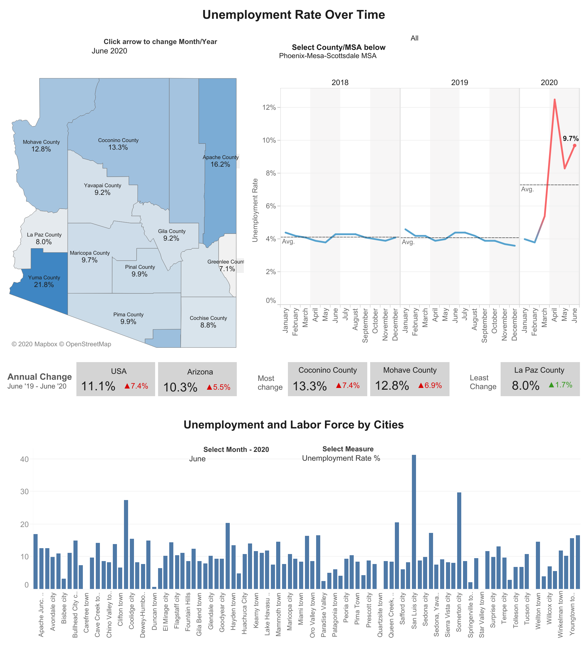
The spike in unemployment in March is a striking confirmation of the job loss for various parts of the state. Mohave County saw the most significant change over time, while San Luis City has hit rates above 40% unemployment.
In March, workers in the leisure and hospitality sector were the first to start showing job loss and soared to the highest numbers every month since, culminating in more than 120,000 new unemployment claims.
Moreover, industries like finance and construction have suffered the least change. Once June hit, the trend changed for construction workers. As of July 21, half of Arizona households with a worker reported losses in employment income, and then one quarter said they experienced housing insecurity.
These findings offer insights into the rapidly-changing challenges that decision-makers face across the whole community.
The Economic Resilience Dashboard is a resource for policymakers, nonprofits, community leaders and residents to get a quick snapshot of the latest available data. The goal is to make this knowledge accessible and useful. Data is updated continuously, as soon as official sources release them.
"It's important to have solid data like this dashboard rather than just opinions when informing decision-making and actions in response to COVID-19," said Sybil Francis, president and CEO of the Center for the Future of Arizona.
She says visual data helps us ask focused questions and find gaps. We may know things intuitively, but these charts put the data in front of you and grab people's attention.
The education section of unemployment claims caught her eye. It shows front-line workers with up to high school education are being hit the hardest.
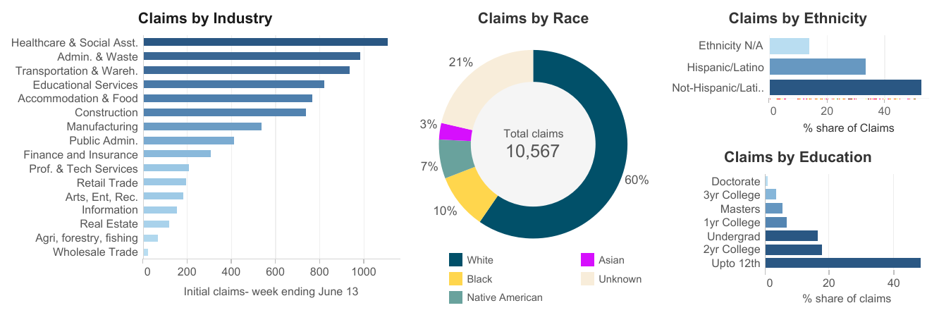
"Even without knowing the specific jobs, we can see that people with lower levels of education are getting hit much harder. What kinds of jobs are they in? What types of circumstances are they living in?” said Francis.
All these questions are part of developing the most resilient responses. Organizations that are both working to address the immediate needs and those planning for future shocks benefit from data.
“Some people don’t have money to pay their bills, they may be at risk of being evicted or don’t have money to buy food. Those are all immediate needs. But, it’s important to keep resilience in mind and to think long term as well,” said Francis.
Francis says a deeper dive helps us discover the bigger questions and address root causes like the need for higher education, changes in the nature of the jobs and employer benefits to help the populations be less vulnerable when another economic stressor like this happens.
In brief, the dashboard supports this kind of planning with visuals that explore past, present and future trends. For example, data provided by the Census Household Pulse Survey offer a prime example of nearly real-time information. The weekly data comes from questionnaires filled out by residents sharing their lived pandemic experience.
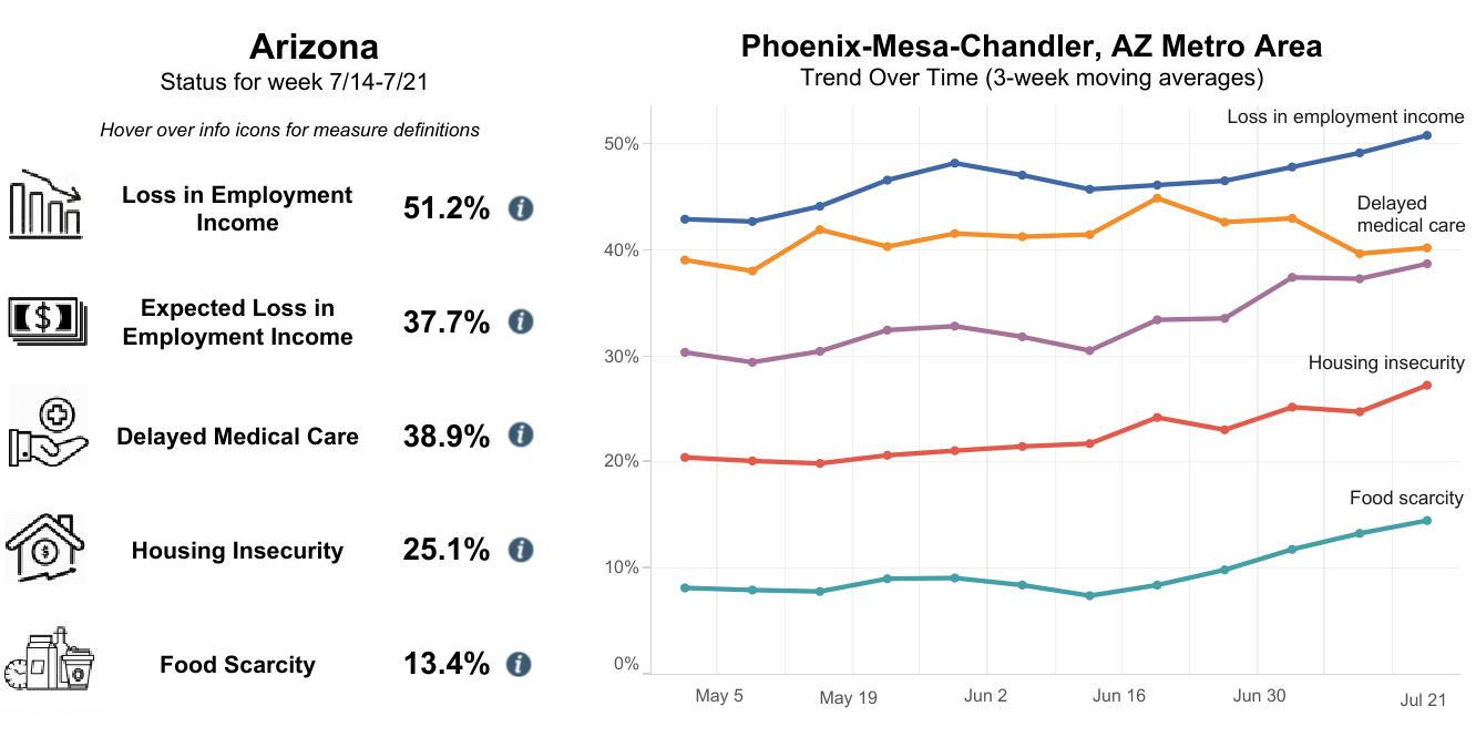
“The pulse survey is extremely valuable because it’s feedback directly from members of the community. The 51.2% of households where someone had lost employment income since March 13 was startling. It gives you a real sense of the scale of what’s happening,” said Cynthia Zwick, CEO of Wildfire.
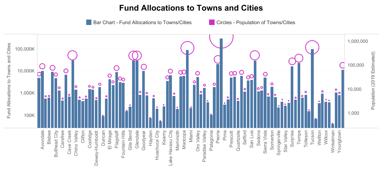
Zwick says people are also really interested in the breakdown of relief fund allocations across cities and how it compares to their own.
“The dashboard is a great opportunity to get a quick snapshot of what everybody else has received and how it compares statewide. It shows how different cities compare and if cities of the same size are receiving similar amounts of money, which is not always the case,” she added.
Indeed, Yuma County has seen the highest unemployment rates, but so far has received the lowest per capita CARES Act allocation.
Data and statistics can be intimidating for some people. Watching a data presentation doesn't allow people to explore on their own. The dashboard's interactive design provides a tool to ask questions and find answers.
"There are groups that have a real interest in making a change in the community but aren't sure where the data is or how to interpret it. This dashboard is going to help change that. You can hover over the data and choose your city or area of interest to explore what matters to you," said Zwick.
All of the maps and graphs are free to download and use in webinars, articles, social media or reports with proper citation. The full dashboard can be accessed here. Feedback to improve the dashboard functionality or requests to monitor additional data is encouraged. Community members can send input to resilience@asu.edu.
More Health and medicine

Bird flu: Your questions on symptoms, spread and safety answered
Bird flu is no longer only “for the birds.”Infections have expanded beyond wild birds and poultry to a range of animals — from…

Making medicine side-effect free
Many drugs that address medical conditions can come with serious side effects. In drug commercials, the litany of potential side…

Diagnostic research happening at ASU focused on detecting diseases earlier to save lives
It was one of America’s founding fathers, Benjamin Franklin, who may have foreshadowed today’s health care innovation when he…